
Dulux Snowy Mountain Half vs Quarter are the same colour at different tint strengths, not two separate whites. Half carries roughly double the pigment load of Quarter, so it reads as a soft, gently warm off-white, while Quarter is the palest version in the family, closer to a whisper of colour than a true shade. Choose Half where you want a wall colour with presence and warmth, and Quarter where you want trim, ceilings or a brighter backdrop that still avoids feeling stark.
Written by a decor and colour specification writer who has spent years pulling apart Dulux whites for renovation clients across Australia and the US.
Most people land on this comparison standing in a paint aisle with two lids that look identical, wondering what “half” and “quarter” even refer to. It is not marketing language. It is a literal measurement of how much tint has gone into the base.
What tint strength actually means for Snowy Mountain
Dulux mixes its whites and neutrals in strength tiers: full, half, and quarter. Full strength carries the complete colourant load for that shade. Half strength uses roughly half of that colourant in the same white base, and quarter uses roughly a quarter. The undertone character does not change between strengths, only the concentration of it.
For Snowy Mountain, that undertone is a soft yellow warmed by a small amount of grey, which is why the colour reads as inviting rather than creamy or dated. At full and half strength, that warmth shows clearly. At quarter strength, the yellow is diluted so far that most people perceive the wall as close to a clean white with only a faint hint of softness left in it.
This is worth sitting with for a second, because a lot of the confusion online treats Half and Quarter as if they are two competing colours with opposite temperatures. They are not. They come from the same formula. What changes is intensity, not character.
Half vs Quarter, side by side
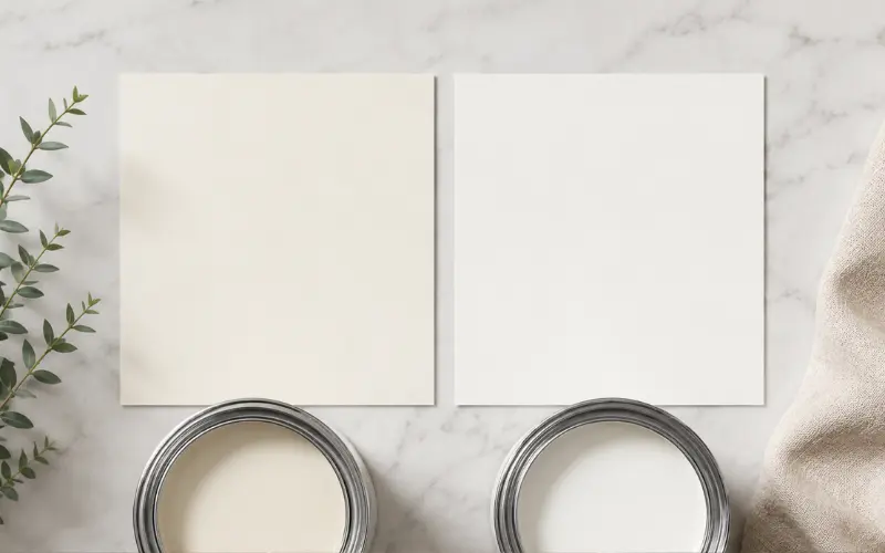
| Feature | Snowy Mountain Half | Snowy Mountain Quarter |
|---|---|---|
| Tint load | Roughly half strength | Roughly quarter strength |
| Visual read | Soft, gently warm off-white with mild presence | Very pale, near-white with a faint hint of softness |
| Best light conditions | South-facing or lower-light rooms that need warming up | North or west-facing rooms already flooded with sun |
| Common role | Main wall colour | Ceilings, trim, and whole-house base coat |
| Feel | Cosy, grounded, a touch more colour on the wall | Bright, airy, low-commitment |
Use this table as a starting point, not a final answer. Paint reads differently in every home depending on flooring, window size, and the direction each room faces.
Where Half earns its place

Half strength is the one to reach for when a room needs some warmth added back in. Rooms that sit on the south or east side of a house, or spaces with smaller windows, often look flat and a little cold under a very pale white. Half strength counters that. It still reads as a white, not a cream, but it carries enough tint to stop a dim room from feeling washed out.
It also works well as a full-coverage wall colour in living rooms, main bedrooms, and hallways where you want the space to feel settled rather than clinical. Paired with oak or blackbutt flooring, Half tends to look considered rather than accidental, because the warmth in the paint and the warmth in the timber sit in the same family.
One thing competitor guides tend to skip: Half strength holds up better against furniture with visible grain or texture. A flatter, cooler white can make timber furniture look slightly at odds with the wall. Half strength narrows that gap.
If you are working on a full renovation and want the walls to complement a white kitchen with a grey stone benchtop, Half strength on adjoining walls keeps the palette cohesive without competing with the stone’s cooler veining.
Where Quarter earns its place
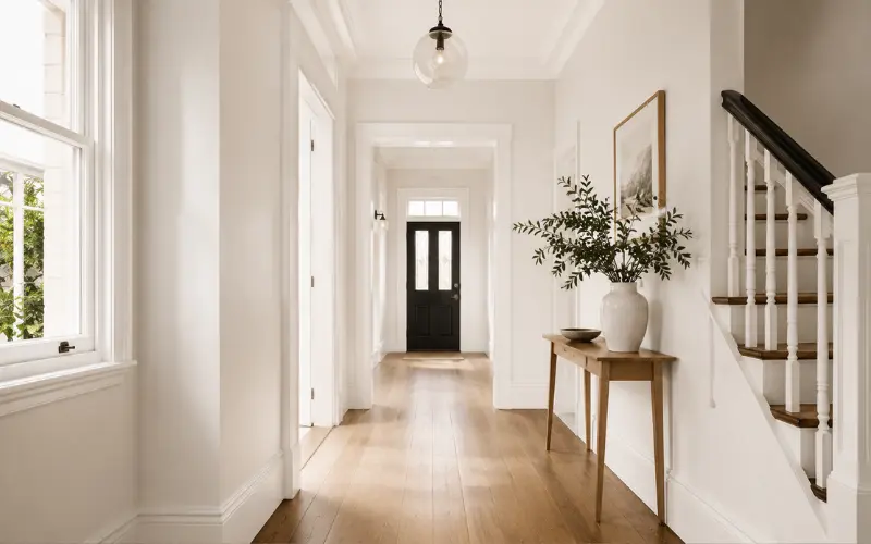
Quarter strength is the workhorse for ceilings, skirting, architraves, and any surface that needs to recede rather than draw attention. Because so little pigment is present, it reflects more light than Half, which is genuinely useful in small rooms, internal hallways without windows, or apartments where every bit of brightness counts.
It is also the safer whole-house choice if you are chasing a clean, contemporary look rather than a warmer, lived-in one. A lot of project builders default to something close to Quarter strength across an entire interior because it is forgiving. It does not clash with timber, stone, or most accent colours, and it rarely reads as too heavy even under strong afternoon light.
For renovation work on older properties, particularly a heritage home renovation where you want the trim to feel crisp against a slightly deeper wall colour, Quarter on architraves and skirting against Half or full strength on the walls is one of the more reliable combinations painters specify.
Exterior applications
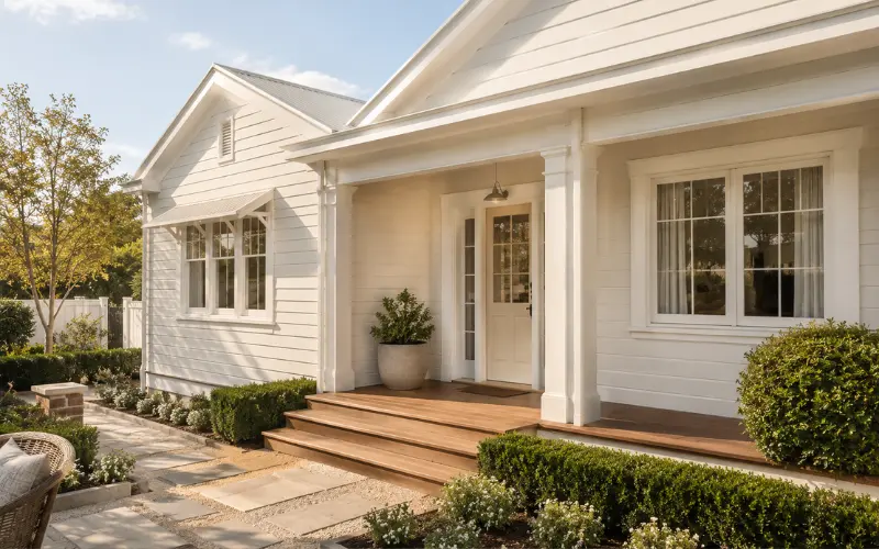
Outside, both strengths behave differently than they do indoors, mostly because there is no ceiling or artificial lighting softening the effect, just direct sun and shadow lines.
On weatherboard or shadowline cladding, Half strength tends to hold its warmth well and looks settled against timber decking, brick paths, and garden greenery. It suits Hamptons-style homes, classic weatherboard builds, and anywhere you want the exterior to feel welcoming rather than sharp.
Quarter strength on an exterior gives a crisper, more modern finish. It is commonly specified on window trims, fascias, and eaves where you want definition without introducing a cooler, blue-based white into the mix. Using Quarter on the trim against Half on the main cladding is a layered approach that reads as intentional rather than mismatched, since both come from the same colour family.
If you are planning a full exterior refresh, this pairing logic is one of the easiest ways to get a coordinated look for a single storey house facade without hiring a colour consultant for every wall.
Pairing with joinery, benchtops, and flooring
A detail most articles on this topic skip entirely: how these whites behave next to manufactured joinery finishes. Half strength pairs cleanly with warm-toned laminates and thermolaminate finishes like Polytec Classic White, because the slight warmth in the paint stops the cabinetry from looking stark against the wall. This matters more than people expect. Mismatched whites between paint and joinery is one of the most common finish complaints after a kitchen or laundry renovation.
Quarter strength, by contrast, sits more comfortably beside cool-toned stone benchtops, polished concrete, and light grey tile. If your benchtop already leans cool, adding a warm wall colour can create a visible clash at the join. Quarter keeps that transition quiet.
For a laundry or bathroom refit specifically, this pairing logic carries over directly. If you are mid-project on a bathroom and laundry renovation, matching the paint strength to your fixture and tile undertone up front saves a repaint later.
Common mistakes people make choosing between them
- Assuming the names describe two different colours. They describe one colour at two intensities. Testing them as if they are unrelated whites misses the point of the range.
- Skipping the sample pot stage. A5 chips under shop lighting do not show how either strength behaves against your actual flooring and window orientation. Paint a 40cm by 40cm swatch and view it morning, midday, and evening.
- Not writing the strength on the quote. Colour name alone can default to full strength at the point of mixing. Always specify Half or Quarter explicitly.
- Using both strengths without a plan. Half on walls and Quarter on trim works because it is deliberate. Randomly mixing strengths across a house without a logic behind it tends to look patchy rather than layered.
- Forgetting to record the strength for future touch-ups. Keep a labelled tin, or note it somewhere permanent. Matching a tint strength from a faded wall sample years later is far harder than matching a standard colour code.
FAQ
Is Dulux Snowy Mountain Half warmer than Quarter?
Yes. Half carries more of the underlying yellow-grey tint, so it reads warmer and more present on the wall. Quarter is diluted enough that the warmth is only faintly noticeable.
What is the undertone of Dulux Snowy Mountain Half?
A soft yellow undertone moderated by a touch of grey, which keeps it from reading as creamy or overly warm while still avoiding a cold, clinical finish.
What undertone is Snowy Mountain Quarter?
The same yellow-grey undertone as Half, just at a much lower concentration, which is why it often reads as close to a neutral white in typical daylight.
Are Snowy Mountain Half and Quarter warm or cool?
Both sit on the warm side of the white spectrum, since they share the same base undertone. Quarter simply carries less of that warmth because of the lower tint strength.
Can I use Half and Quarter in the same room?
Yes, and it is a common approach. Half on the walls with Quarter on the ceiling, trim, or skirting creates gentle contrast while keeping the whole scheme in one colour family, which avoids any risk of clashing whites.
Which one should I use for a small, dark room?
Quarter is usually the better call for rooms with limited natural light, since it reflects more light and helps a small space feel more open. Half can work too if the room feels flat and needs a touch of warmth added back in.
Does Snowy Mountain Half vs Quarter work well against Vivid White?
Both will look noticeably softer and warmer next to Vivid White, which is a much starker, cooler white. That contrast can work well for trim details, but avoid using Vivid White as a ceiling colour with either strength on the walls, as the jump can feel abrupt.
Do I need to test both strengths before deciding?
Yes. Order sample pots of each, paint swatches at least 40cm square directly on your wall, and view them across the day. Lighting direction changes how much warmth either strength shows far more than the paint chip suggests.

