
Home decor signs sayings look expensive when the wording is short, the typography has real weight or hand-lettered texture, and the material matches the room’s finish instead of fighting it. Cheap-looking signs usually fail on one of those three points, not all of them, which is why fixing the right variable matters more than replacing the whole piece.
Why Some Sign Sayings Read as Budget No Matter the Price Tag
I’ve hung a $95 sign that looked like a dollar-store leftover and a $14 thrift find that guests assumed came from a boutique. The difference wasn’t the price. It was proportion and finish.
A saying crammed onto a board that’s too small gets cramped letter spacing, and cramped spacing is the single fastest way to make a sign look mass-produced. Retailers batch-print thousands of the same layout because tight spacing lets them fit more words per square inch of board, which cuts material cost. When you see it in your own living room, your eye reads “template” even if you can’t name why.
The fix isn’t always a new sign. Sometimes it’s swapping the frame, adding a mat border, or mounting it on a riser so the saying has breathing room around it.
The Wording Rule Competitors Don’t Mention
Most sign roundups list phrases. Almost none explain sentence length as a design variable, but it is one.
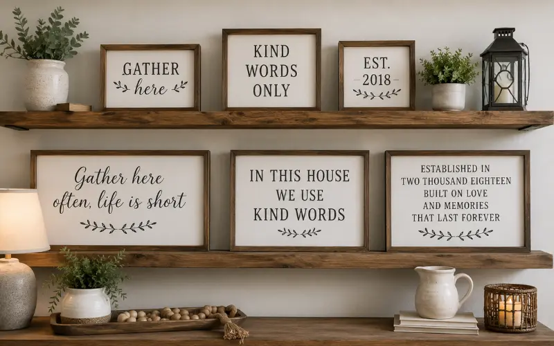
Signs under six words photograph better, read faster from across a room, and pair with almost any typeface without looking busy. Longer sayings need a script font or a stacked layout to avoid looking like a printed paragraph nailed to a board. If you’re drafting a custom phrase rather than buying pre-made, count your words before you count your budget.
A few examples that hold up at a glance:
- “Gather here” instead of “Gather here often, life is short”
- “Kind words only” instead of “In this house we use kind words”
- “Est. [year]” paired with a family name, rather than a full sentence
Material and Finish: The Variable Most Buyers Skip
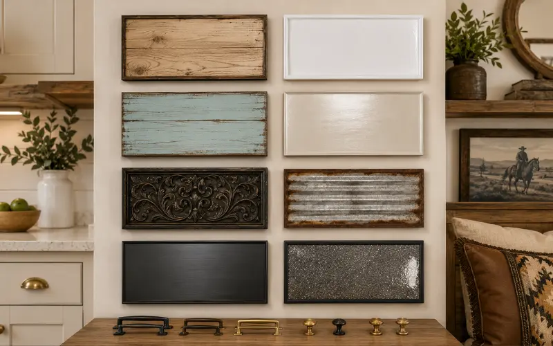
Wayfair and Hobby Lobby both sell the same three base materials on repeat: painted MDF, raw wood, and metal. What separates a builder-grade look from a designer one is whether the material matches the room’s existing hardware finish.
| Room Style | Sign Material That Reads Expensive | Material That Reads Cheap |
|---|---|---|
| Modern farmhouse | Raw or whitewashed wood, visible grain | Glossy painted MDF |
| Coastal or cottage | Distressed wood, matte finish | Shiny laminate |
| Traditional or old-world | Cast metal or carved wood | Thin stamped tin |
| Contemporary minimal | Matte black or brushed metal | Glitter or high-gloss vinyl |
If your cabinet pulls are brushed brass, a raw pine sign with black iron hardware will look intentional. The same sign with shiny gold trim competes with the room instead of finishing it.
For anyone leaning into a specific regional or vintage look, pairing a wood sign with broader vintage western home decor styling, or a full western home decor approach, keeps the saying consistent with everything else on the wall rather than sitting there as an isolated purchase.
Placement Mistakes That Undercut Even a Good Sign
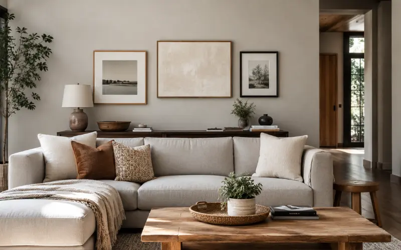
Pinterest boards make signs look effortless because the photos hide the measuring tape work. In real rooms, three placement habits quietly ruin good sayings:
Hanging at eye level for a standing adult in a room where people mostly sit. In a living room, your eyeline while seated is roughly 6 to 10 inches lower than standing. A sign centered for someone standing looks too high once you sit on the couch.
Grouping a sign with frames of wildly different depths. A flat canvas print next to a thick 1.5-inch wood sign creates uneven shadow lines that read as mismatched rather than curated.
Centering over furniture instead of over the wall segment. If a sofa sits off-center on its wall, center the sign to the wall segment, not the sofa. It looks off in photos otherwise, even when it looks fine standing in the room.
Where Sign Sayings Actually Belong by Room
Not every room takes every tone of saying well, and this is where a lot of shoppers guess wrong.
- Kitchen: Short, food- or gathering-themed phrases hold up best here because steam and grease shorten the lifespan of anything with fine print or foil lettering.
- Living room: This is where longer, more personal sayings work, since people spend seated time actually reading them.
- Entryway: Welcome-style phrases perform well, but only if the sign is weatherproof or under cover; humidity swings warp raw wood fast.
- Bedroom: Softer, quieter phrasing reads better than bold statement pieces, which tend to feel loud in a room meant for winding down.
If your household leans toward a specific aesthetic, this is also where broader style choices matter. A cottagecore home decor household will lean toward botanical or nature-adjacent phrasing, while a glam home decor space usually skips sayings altogether in favor of mirrored or metallic accents, using text sparingly if at all.
DIY vs. Buying Pre-Made: The Real Cost Comparison
Competitors treat DIY as automatically cheaper. In practice, it depends on tool ownership.
If you already own a wood burner, stencils, or a Cricut, a DIY sign runs $8 to $20 in materials. If you’re buying tools for a single project, a pre-made sign from a small maker often costs less once you account for blades, paint, and sealant. Browsing handmade wood home decor sellers is usually the better move for a one-off piece, while DIY makes more sense if you’re planning several signs across a few rooms and can spread the tool cost across all of them.
Seasonal Swapping Without Buying New Signs Every Quarter
One thing almost no competitor article covers: you don’t need a new sign for every season if you build one with a swappable insert. A simple shadow-box frame with a chalkboard or interchangeable panel lets you rotate a phrase for fall, the holidays, or a birthday without replacing the whole piece. This also solves the storage problem that comes with owning eight different seasonal signs, since you’re storing thin inserts instead of full boards.
From my own experience styling rental listings, this single swap-panel trick has cut client sign budgets by close to half over a year, since one frame does the work of four or five separate purchases.
Bringing It Together in a Cozy, Cohesive Space
A Home Decor Signs Sayings rarely works in isolation. It reads best as one note in a layered wall, alongside texture from baskets, framed art, or shelving. If you’re building that layered look from scratch, starting with a cozy home decor foundation and then adding one or two well-chosen sayings, rather than several competing ones, tends to hold up better over time than filling every open wall space at once.
Frequently Asked Questions
What are some good slogans for Home Decor Signs Sayings?
Short, room-specific phrases work best: “Gather here,” “Bless this home,” or “Rest and stay awhile” for a bedroom. Keep it under six words for the cleanest visual read.
What are some ideas for Home Decor Signs Sayings?
Pair a short saying with a swappable seasonal panel, group it with framed art of varying but complementary depths, or letter it directly onto a wood slab for a more custom, less templated look.
What are some short quotes about Home Decor Signs Sayings?
Phrases like “Home is where the heart is,” “Simply blessed,” and “Est. [your year]” work well because they’re brief enough to read from across a room without a script font.
What are some funny quotes I can use for Home Decor Signs Sayings?
Kitchen-specific humor tends to land best: “This kitchen is seasoned with love” or “Never trust a skinny cook” both work because the joke matches the room’s function.
Are wood home decor signs sayings better than metal ones?
Wood suits farmhouse, coastal, and cottage styles, while metal reads better in traditional or industrial spaces. Match the sign material to your existing hardware finish, not just your favorite look.
Where can I find free home decor signs sayings I can print myself?
Many font and printable-art sites offer free downloadable phrase templates you can print and frame yourself, which is a low-cost way to test a phrase before committing to a wood or metal version.
What size should a small wooden sign with a saying be for a shelf?
For open shelving, 8 to 12 inches wide keeps the sign proportional without crowding other decor pieces on the same shelf.
Do sign sayings work in every room, or just the kitchen and entryway?
They work anywhere, but the tone should shift by room. Bold or funny phrases suit kitchens and entryways, while bedrooms and living rooms hold up better with softer, more personal wording.

