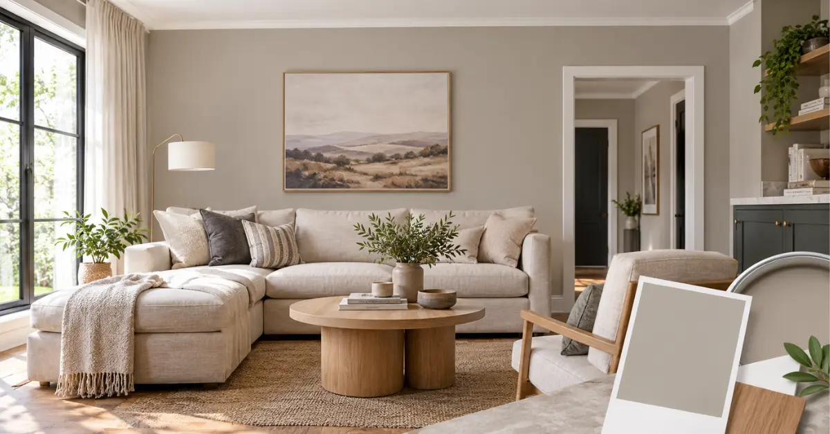
Dieskau is a Dulux greige: a soft grey-beige with a warm, slightly mauve undertone. It sits in the mid-light range, so it brightens a room without the starkness of white. It works best when you pair it with crisp white trims, warm timber and one darker neutral for depth.
The Numbers Behind the Colour
Dieskau Dulux with an LRV (Light Reflectance Value) of 62, a hex code of #cbc9c5 and an RGB value of 203, 201, 197. The Atlas reference is SN4H1 and the chip is GR12. Its solar absorptance is 0.475.
An LRV of 62 puts it above the middle of the scale. It bounces plenty of light around, but it still reads as a real colour on the wall rather than a near-white. That’s why it suits living rooms and hallways that need warmth without a heavy feel.
The solar absorptance figure matters if you’re thinking about outdoor use. A lower number means the surface absorbs less heat. Dieskau sits in a sensible range for a mid-tone, though Dulux notes the figure applies to standard coatings, so check with their help team for specific products.
My take: Most people choose greige for its neutrality, then get surprised by the undertone. Read the hex code as a starting point only. A screen will never show you how a mauve-leaning grey behaves on your own wall.
Why the Mauve Undertone Changes Everything
Plenty of greiges lean yellow or green. Dieskau Dulux leans slightly toward purple, and that softens it. It feels gentler and a bit more refined than a sandy beige.
The catch is that the undertone shifts with your light. In Australia, north-facing rooms get strong, warm sun, and Dieskau will look creamy and settled. South-facing rooms get cooler light, and the mauve can come forward, giving a faintly pinkish-grey cast.
Your globes matter just as much. Cool white LEDs (around 4000K and above) push the colour toward a flat grey. Warm globes (2700K to 3000K) keep it cosy. If you’re repainting a room and haven’t chosen lighting yet, decide on the globes first.
Colours That Go With Dieskau
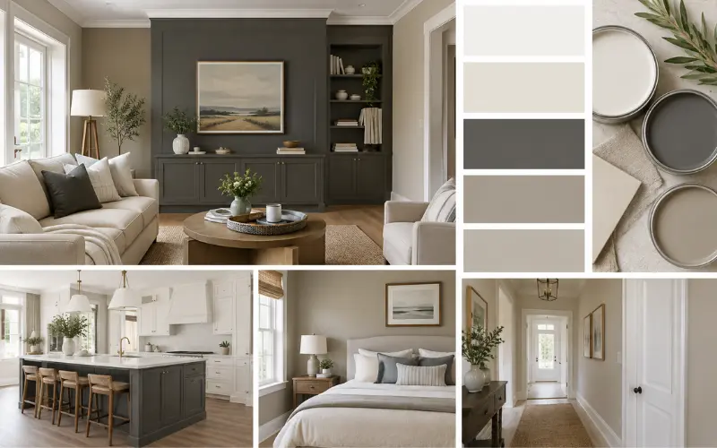
Dieskau Dulux schemes well with Klavier, a warm dark grey, and with the mid-toned greiges Teahouse and Stepney. Its featured pairing scheme uses Silver Tea Set and Hammer Grey. For trims, Dulux points to Lexicon Half or Vivid White for a Hamptons look.
| Colour | Best use | What it does |
|---|---|---|
| Vivid White | Trims, doors, ceilings | Crisp contrast that sharpens the greige |
| Lexicon Half | Trims, cornices | A softer, creamier edge than pure white |
| Klavier | Feature wall, joinery | Adds depth without clashing with the warm undertone |
| Teahouse / Stepney | Adjoining rooms | Keeps the palette tonal and calm |
Choose a single trim white and stick with it through the house. Switching between whites room to room is the quickest way to make a calm palette look messy.
How to Build a Balanced Room Around It
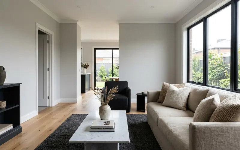
Balance comes from three layers: a light base, a mid-tone anchor and one dark accent. Dieskau is the base. Think of the rest as your supporting cast.
- Walls in Dieskau, usually in a low-sheen finish for living areas.
- Trims and ceilings in white, with flat ceilings and semi-gloss on doors and skirting.
- One darker element, such as a Klavier-painted bookcase, black window frames or a charcoal rug.
- Texture over pattern, with linen, boucle, rattan and honed stone doing the heavy lifting.
Timber deserves a closer look. Honey and golden timbers like blackbutt or Tasmanian oak warm Dieskau and make it feel intentional. Very red timbers can pull out the pink in the mauve, so hold a sample against your floor before you commit.
Field note: If a room feels flat after painting, it’s rarely the wall colour. It’s usually missing contrast. Add a darker piece or a stronger trim white before you repaint.
If you’re planning a kitchen with stone, I’ve covered how greys and whites behave together in a white kitchen with a grey stone benchtop. The same logic applies when Dieskau is your wall colour.
Room-by-Room Notes
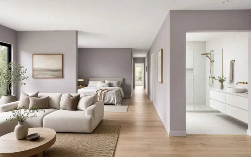
- Living rooms: This is Dieskau’s strongest use. It handles changing light well and works with both timber and soft furnishings.
- Bedrooms: The mauve undertone makes it restful. Go one step darker on the bedhead wall if you want a cocooning effect.
- Hallways: An LRV of 62 helps in narrow, dim passages. It brightens them without the starkness of white.
- Bathrooms: Works well with white tiles and brushed brass or chrome. For more layout and colour ideas, see these modern bathrooms in Australia.
- Open-plan spaces: Use it across the whole space for continuity, then separate zones with rugs and furniture instead of colour changes.
Using Dieskau Outside
Dieskau Dulux can be used on exterior walls or trims when you’re working with darker greiges and greys. In other words, it’s a supporting colour out there, not the hero.
It works as a trim or eave colour against a deeper grey or charcoal wall. On a full exterior wall, it can read very light in strong sun. If you want a coastal or Hamptons look, pair it with white windows and natural timber details. For inspiration on that style, take a look at these Hamptons-style homes on the Gold Coast.
Always use an exterior-rated paint such as Weathershield for outdoor surfaces. Interior paint won’t hold up to UV and weather.
Half and Quarter Strength Versions
You’ll often see searches for Dieskau Half and Dieskau Quarter. These are lighter, weakened mixes of the same colour. Quarter is the palest, Half sits in between, and full strength is the version Dulux lists with the specs above.
The weaker versions are useful when full Dieskau feels a touch heavy for a small or dark room. They also let you stay in the same colour family across rooms, using the lighter version where light is limited. I haven’t seen published LRVs for each strength, so treat sampling as non-negotiable. If you want to see how strength variations play out in practice, I’ve compared them in this guide to half versus quarter strength.
How to Test Dieskau Properly
At the time of writing, Dulux lists A4 colour swatches at $2.00, A4 stickers at $3.50 and 100 mL sample pots at $6.50. A pot is the best option, because paint on the wall tells you more than a printed card.
- Paint a board of about 1 m by 1 m in two coats.
- Move it around the room, including beside windows, in corners and near trims.
- Check it in morning light, midday, dusk and under your evening lamps.
- Place your trim white next to it, plus a piece of your timber or flooring.
- Wait a full day before judging. Wet paint and dry paint don’t look the same.
Dulux also notes that surroundings change how a colour reads. A green garden outside the window, red brick across the street or bright furniture can all bring out different undertones.
Common Mistakes
- Judging it on a screen. Hex codes are guidance, not a match.
- Skipping the trim test. A yellow-leaning white will make Dieskau look dirty.
- Using cool LEDs. They strip the warmth you chose it for.
- Painting a small area and calling it done. Large surfaces look different to a small swatch.
- Forgetting the ceiling. A stark white ceiling against warm walls can feel harsh. A flat white is usually kinder.
FAQ on Dieskau Dulux
What is Dulux’s most popular colour?
Dulux doesn’t publish one single ranking. Soft whites such as Natural White and Vivid White are commonly cited as best sellers, and Dulux features a “Most Loved” selection for each colour family on its website.
What does the name Dieskau Dulux mean?
Dulux hasn’t published an official meaning that I could find. It may nod to the German baritone Dietrich Fischer-Dieskau, which would fit the musical feel of the neighbouring name Klavier, but that’s speculation rather than confirmed fact.
Can I buy Dieskau Dulux at Bunnings?
Dulux paints are widely sold at Bunnings and tinted to colour in store. Confirm that Dieskau is available in your chosen product and size with your local store, as ranges can vary.
Does Dieskau Dulux suit kitchen cabinetry?
It can, particularly in a satin or semi-gloss finish with brushed metal handles. Test it beside your benchtop first, because stone undertones can fight with the mauve.
Is Dieskau Dulux a good colour for a small room?
Yes, particularly with good natural light. In a dim room, consider the Half or Quarter versions or add layered lighting.
What ceiling colour works best with it?
A flat white such as Vivid White works well. Lexicon Half gives a softer look if you want less contrast.
Will it look pink on my walls?
Not usually. The mauve is subtle, but it can show in cool, south-facing light or beside very red timber, so sample before painting.
Can I use it with black window frames?
Yes. Black adds crisp contrast and stops the greige from feeling too soft. Keep the trim white clean and consistent to avoid a muddy look.